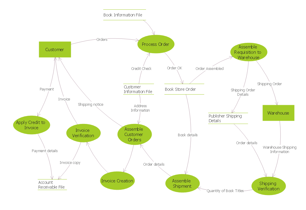
Above is an example of a data flow diagram. Data flow diagrams are commonly used in software development. They are also good at displaying the movement of data through a system with different entities. This diagram shows the process of ordering books online. It runs through every step between the moment the order is sent to its delivery.
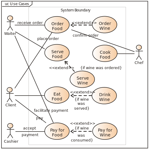
A Use case diagram is a way of simplifying the actions and products in a system much like a data flow diagram. Use case diagrams often shows a number of entities in this case people with lines linking them to actions they perform. This allows for easier visualization of complex interactions. The example of above is used to display them workings of a restaurant.
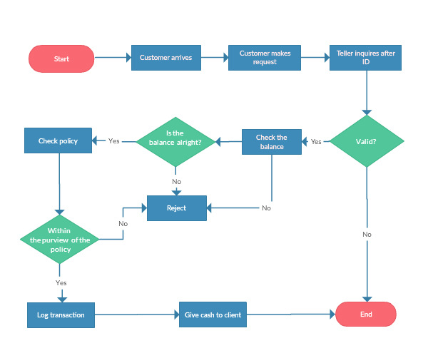
Above is a systems flow chart. Systems flow charts are good at showing a decision making process and determining what you should do given a scenario. Different shapes and colours are used to describe different things. A blue rectangle represents a process like checking something. A green diamond in the above diagram represents a decision and thus each green diamond marks a split in the flow of a system. Red rectangles with round edges are used to mark the beginning and end of the flow chart.
A HIPO( Hierarchy plus input- process output) diagram is used to organize lists of objects or decisions by starting with simple classifications and increasing specificity as it goes down. It can be used to display a series of tasks in order of importance making it easier to make goals.
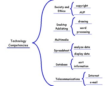
A Warnier Or diagram starts to the left with a general topic and as it progresses right moves to more specific concepts. It has similar characteristics to a HIPO chart. Except for its use of left to right instead of up to down flow as well as its use of a bracket which is used to include and not separate.
